To the night owls →

Graphic design

#Brøndby IF #artdirection #graphicdesign
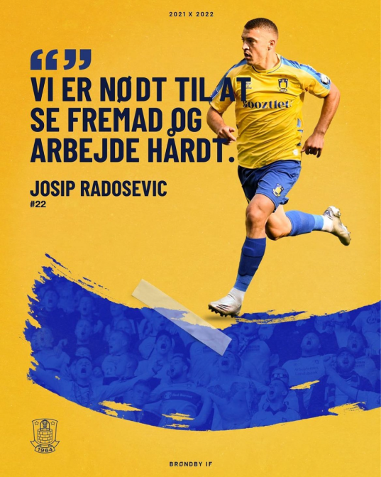
Client Brøndby IF

Year 2021

Industry LifestyleSportCulture

Task

Design of the visual and graphic expression for Brøndby IF's upcoming SoMe for the 21/22 season.

With a drop in the number of exposures and likes, and general negative publicity about the design on Brøndby IF's platforms, a new visual strategy that speaks more to the core target group was needed.

Execution

Based on a target group analysis, interviews and collaboration with fans, I gained insight into the target group and culture of the trustworthy Brøndby fans. This allowed me to design the graphic expression based on the values that reflect the fans and their view of who their club is and should represent.

Results

Through the use of a new graphic expression for 21/22, Brøndby IF achieved extensive and positive media coverage, more impressions and more likes in the first 60 days compared to the 20/21 launch.

29% more impressions
34% more likes
Positive mentions of the design in the comments

Say Hi!

Follow me